Sky: Order tracking
Web
Client
Sky
Role
UI Designer
Year
2015
The Story
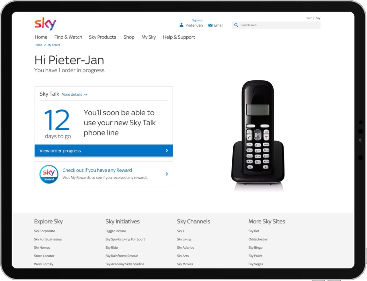
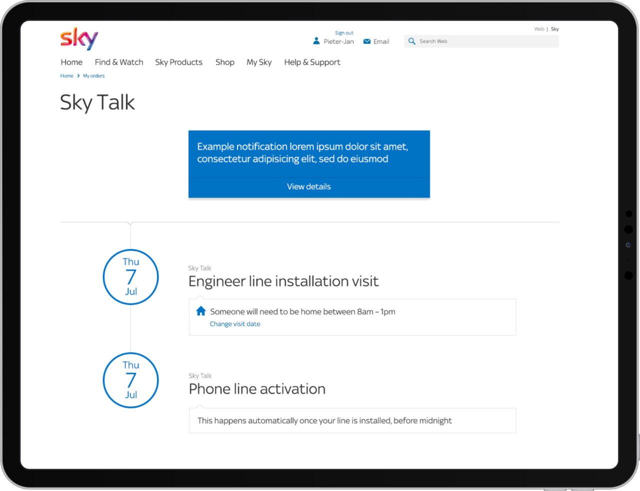
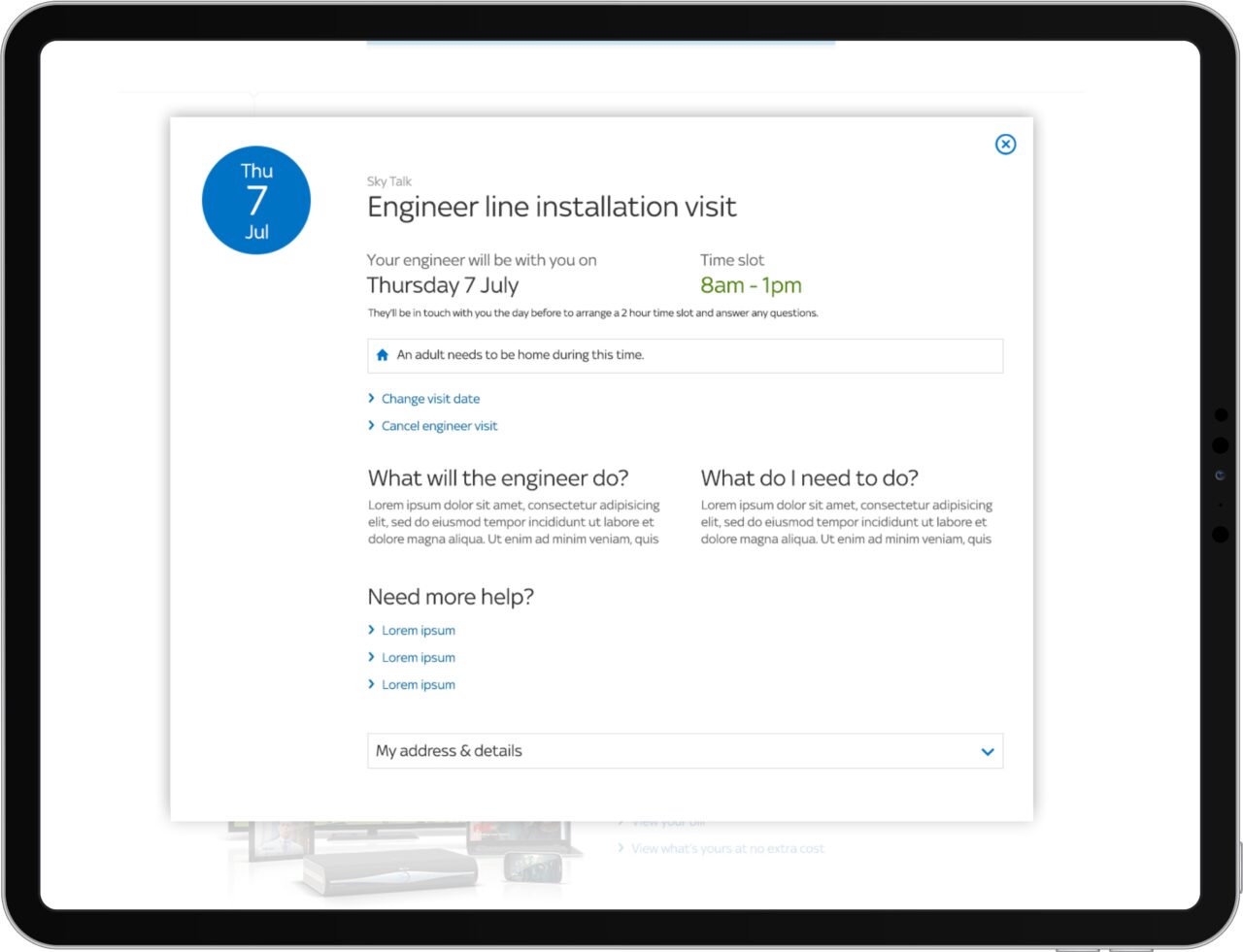
Working closely with my UX designer colleague, we redesigned the Order Tracking experience on Sky.com from scratch.
The existing experience was not responsive, outdated and raised more questions than answers for the user. The journey consisted of one page, which did not provide the user with enough information about their order, causing a lot of users to call up the call centre.
We started from the ground up, optimising the journeys to make sure the essential information was presented clearly and bite sized, adding additional information where needed.
One of the challenges was that we needed to use the same (limiting) backend services.
The results after release were good, showing a decrease in users calling the help centre and an increase in user goal achievement.
Drag