Client
Just Eat
Role
Senior UI Designer
Year
May 2018
The Story
Making it easier to find, compare and choose restaurants
While working on the full redesign of the global Just Eat Android/iOS apps and website, one of the concepts that I explored was bringing a stronger focus to cuisines, specifically the cuisines that customers look for most often.
Research insights
From existing research it was found that the main first thought a user has when ordering food for delivery, is the type of cuisine they’d like to order. Sometimes this means the user is set on one cuisine in particular, sometimes it means the user has a few cuisines in mind and would like to explore and compare cuisines.
Originally cuisines were hidden behind one of the items in the top app bar “Cuisines”. While not completely hidden, it required multiple taps to get to the Cuisine filters and back to the search results with the desired Cuisines filters enabled.
Hypothesis
To improve the ease of use of filtering restaurants, I worked with the hypothesis “If filtering by cuisine type is easier to find and requires less actions from the user, the reduced friction can improve the amount of orders placed and increase user’s perception of ease of use.”
Early testing
To validate concepts, a mix of quick testing was used via WhatUsersDo.com in combination with A/B testing before releasing successful variants to the live product. Before coming to the final solution I had a few iterations which we tested and validated to be an improvement.
Some of the earlier iterations came direct from the global redesign.
The global redesign was a future vision of where to take the products, from which this was one of the examples that we were able to apply to the live product. One of these was to initially just add imagery to the “Cuisine” filter and add small “Applied Cuisine filter” tags once having selected Cuisines.


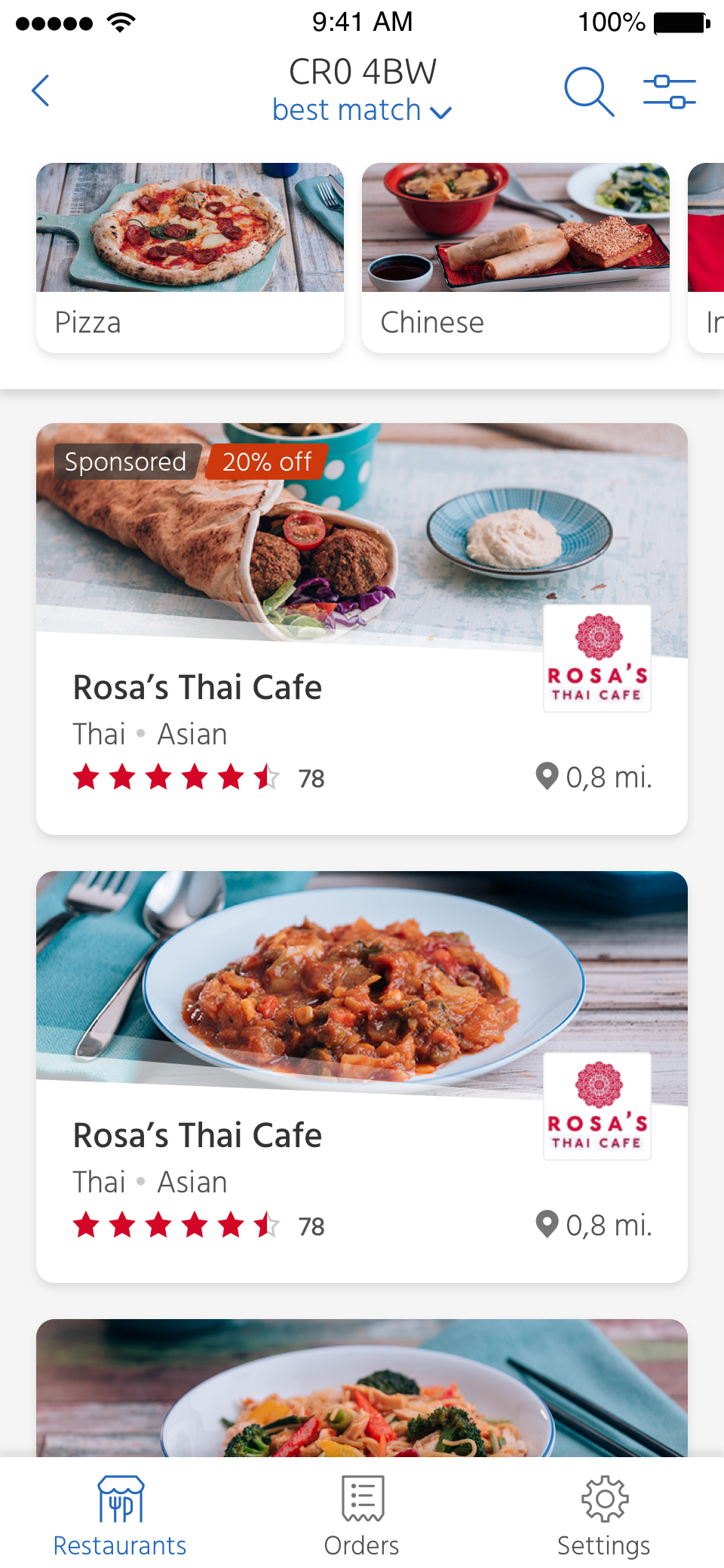
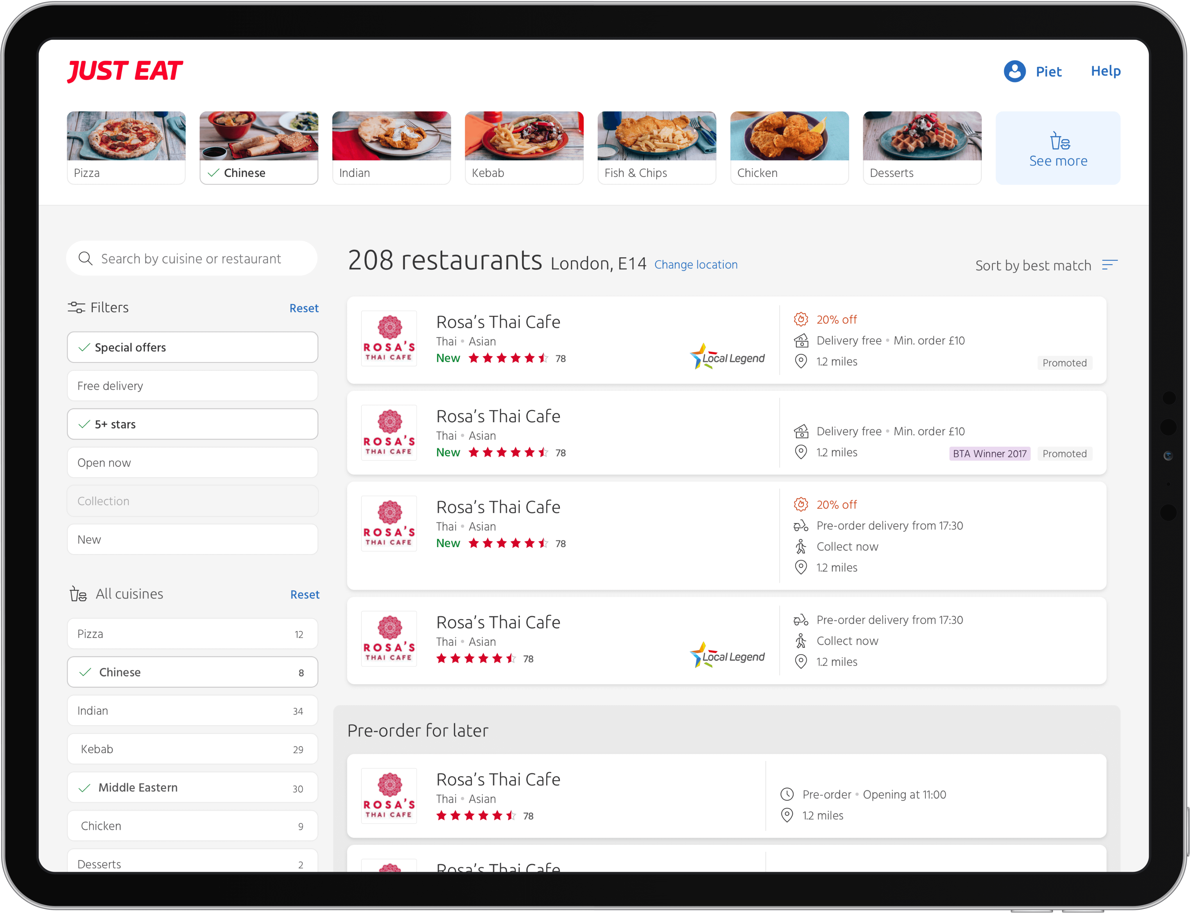
“Cuisine Carousel”
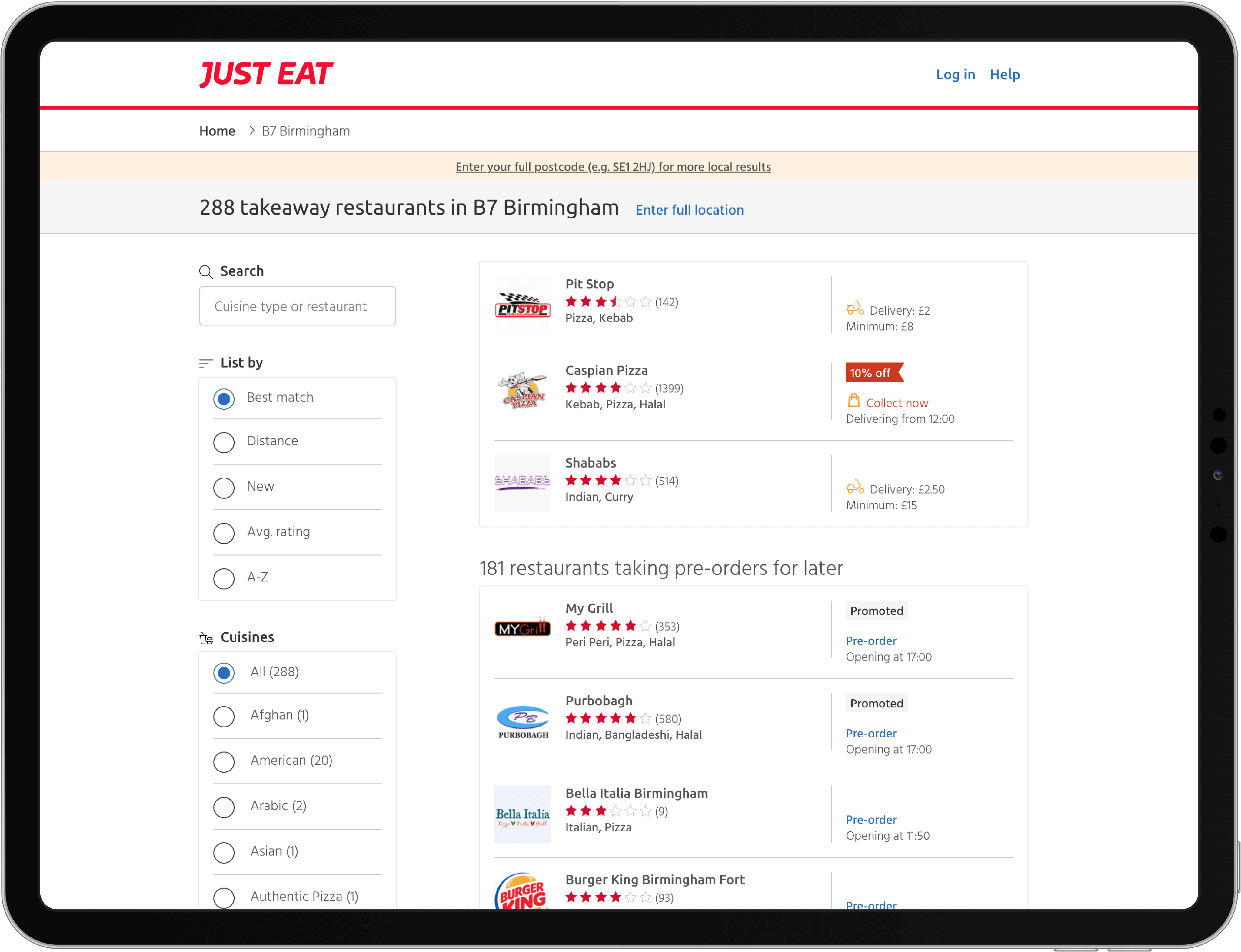
While working on the tablet view for this concept, I realised the ease of accessing the filters was so much quicker on the larger viewport, as the filters are displayed alongside the restaurant search results.
This was one of the reasons I designed what would eventually be released to the live product called the “Cuisine Carousel”, where cuisine filters are displayed at the top of the view without the need to open up a filter view.
The cuisines displayed horizontally are the top 6 most popular cuisines, giving the user a quick and efficient way to find restaurants they’re interested in. At the end of the horizontal scrolling list there’s a call to action to view more cuisines, opening up a full “Choose cuisines” page.

MVP ➔ A/B Testing
We tested the Cuisine Carousel as a variant in a live A/B test. This first build was an MVP, with just the most basic functionality of displaying the 6 top cuisines with a CTA to open the full list of cuisines.

Iterate ➔ Improve
After releasing the MVP, I worked on improvements that added additional functionality:
- Set the Cuisine Carousel bar to hide when scrolling the page and reappear when scrolling the opposite direction
- Append cuisines into the carousel that are not in the top 6 that were selected in that session on the full list of cuisines
The result


The A/B testing and analytics on the iOS app showed the cuisine carousel is expected to provide over 400.000 additional orders yearly (on iOS). The improvements were released on iOS initially and rolled out to Android and Web later.
Note: The live apps have received design changes that are not my work.
Another challenge
A lot of data points – not a lot of space
Another element was the design of the individual restaurant listings.
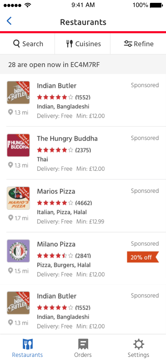
The then-current design had been in use for years without any attention, while more and more data points were added to it overtime through experiments. This made for a hard-to-scan layout that was creating various issues visually and aesthetically it made the page feel outdated.
From “New” tags to “Promoted” and special offers, there was many different types of required and optional tags needing to live side by side.
The assumption at that point of time was that any changes to the search results listings was a high risk, especially if it impacted the amount of listings shown per-view would be reduced.
Hypothesis
I worked with the hypothesis “By optimising the restaurant listing layout and reducing the amount of listings shown at once, this will reduce the risk of cognitive overload and it will improve the ease of use resulting in an increase of order placed.”
MVP
The first version that we tested and verified via A/B testing made the restaurant listing look less information packed and easier to scan.
The layout is designed to be flexible to support many types of data points in various combinations. This makes it easier to run any necessary experiments, without sacrificing the user experience.


Iterate ➔ Improve
Following the successful A/B test of this variant, I continued optimising the restaurant listings to include the much needed restaurant image and updates to how labels are presented using light gradient colours at the bottom of the listings. Additionally I added a subtle bit of branding with the transparent rays separating the content with the image. This was another element I created as part of the global redesign, which was fed into this piece of work on the live products.
The result
Testing and analytics on the iOS app showed the new design is expected to provide over 650.000 additional orders yearly (on iOS).
This is on top of the estimate provided by the cuisine carousel, which together is an estimated of over 1 million additional orders yearly on iOS alone.
All these improvements were rolled out to both Android and Web shortly after iOS.